Grout colour and what it does to a pattern
Grout is a quarter of what is seen and it is usually chosen last, in a hurry, from a shelf.
A joint that matches the tile makes a surface read as a single field. A joint that contrasts turns the same tiles into a visible grid. Neither is better; they are different intentions, and the decision deserves to be made before the tiles are bought rather than after they are fixed.
Matching joints flatter irregular handmade tiles, because variation in size stops being legible once the outline disappears. Contrasting joints flatter very regular machine-made tiles, where the grid is crisp enough to be worth drawing attention to, and punish irregular ones by making every deviation into a wobbling line.
Small formats change tone more than expected. A mosaic sheet has far more joint per square metre than a large-format tile, so the grout colour dominates the overall impression. A dark grout with a pale mosaic is effectively a dark surface with pale flecks.
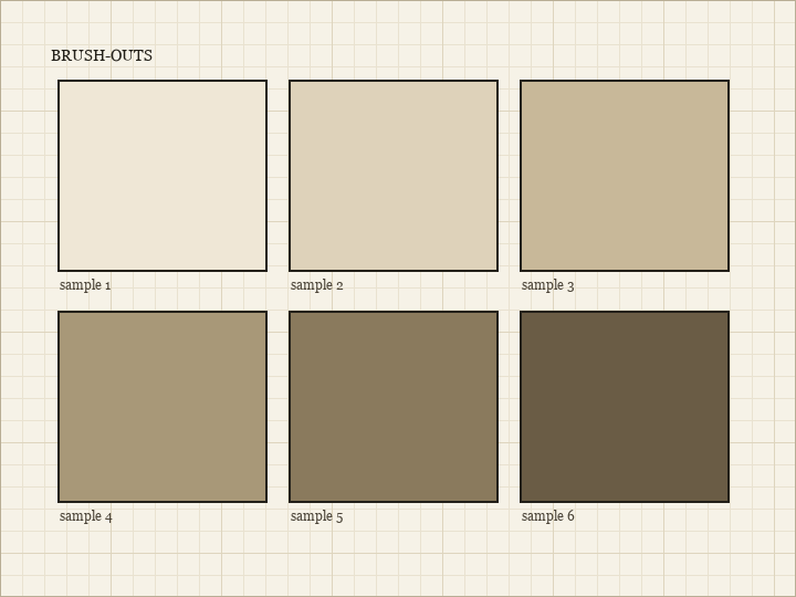
Test on a dry-laid sample rather than judging from the powder or the wet mix. Grout dries considerably lighter than it looks when wet, and a colour chosen from the bucket will consistently disappoint by a couple of shades.
Practicality argues for mid tones almost everywhere. Very pale joints on a floor show every mark; very dark joints on a wall show limescale and soap. A mid tone hides both reasonably well and dates less obviously than either extreme.
Joint width and colour interact. A wide joint in a contrasting colour is a strong graphic decision that will still be there in ten years; a narrow joint in the same colour is a detail. If there is doubt, keep the joint narrow and the contrast modest, because that combination is the easiest to live with.
Whatever is chosen, mix every batch the same way and to the same consistency. Grout colour varies with water content, and a second batch mixed wetter than the first will dry paler, leaving a visible boundary across the middle of the wall.